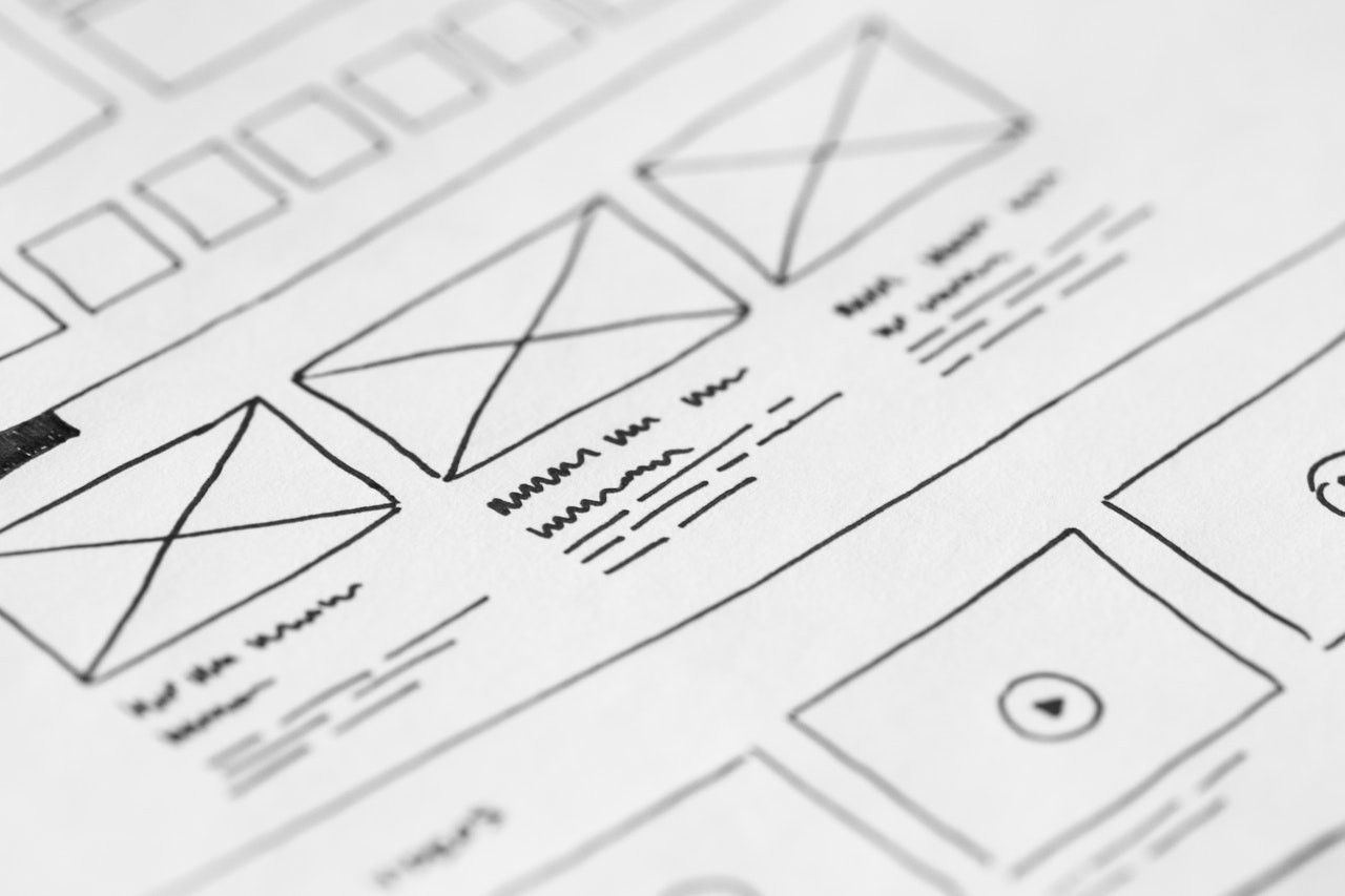
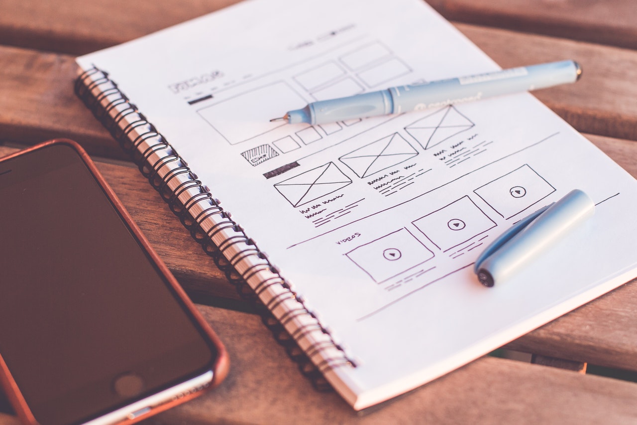
Do you feel your website has undergone a drastic reduction of leads? It is time to reflect if you are earning a solid return on your website investment? Are the aesthetics powerful enough to provide a wholesome experience to the visitors?
Not surprisingly, you’ll find yourself responding negatively to the latter two questions. The digital landscape is a crowded place nowadays. A portal may cease to exist altogether if it does not put its best foot in the market.
Browse for the best virtual players, and their websites will leave you in awe. These sites push the boundaries of what is known to be possible on the web. From usability to interactivity and design aesthetic, each one speaks mastery and perfection.
Why Does Website Design Matter?
Expecting your online store to generate leads without any upgrading can lead you to a corporate disaster. As per a report by Stanford, three-quarters of people judge a company by their web design. It determines their position in the purchase funnel and their perspectives about a venture.
In light of these figures, it is apt to state that your site needs a breath of fresh air now and then. The goal should be to optimize your portal as much as possible.
Best Website Redesign Practices
 Building a perfect eCommerce website is not a one-step process neither it depends on one absolute element. Lots of factors contribute to the designing or redesigning of a website.
The following are the four most essential elements to incorporate in your upgrading strategy. If you implement these tips, the performance of your site will improve dramatically:
1. Minimize Text
Less is more. We have heard this adage in different circumstances. You’d be surprised to know it is ruling the digital arena too.
Gone are the days when users scanned the entire website to find the product they were looking for. Now, they would rather switch to a rival site instead of scrolling about your pages. The minimalistic web design has become a rule of thumb when it comes to developing a functional website. Its main features are:
- Focus on essential content – It works to eliminate excess and useless elements from the interface
- Ample use of negative space – It uses white space to create segmentation between content and allow the visitor’s sight to relax
- Flat design and texture – Everything from fonts to icon is kept at a minimum, enhancing the functionality
According to GoodFirms, almost 85 percent of small businesses are guilty of crowding their sites with excessive on-page elements.
The key is to convey your message using the least number of words possible.
2. Add More Visuals
Visual content has always been a priority in marketing campaigns. Although recently, it began gaining more steam. The main reason being that an average human attention span has shrunken down to eight seconds. You have to catch them in these eight seconds of doom!
The job of a designer is to communicate a brand’s essence through the visual choices they make. It doesn’t only help them to explain the text but also allows the company to explain things in detail. Your prospects will fathom intricate company details with a clearer perspective when they watch the visuals.
For instance, if you are selling skincare products, you can create videos illuminating how the background procedures work. Besides, using custom photos instead of material picked from stock adds life to your portal. Spritz Web Solution noted that photographs are crucial for online retailers. When customers identify a familiar human face behind the venture, their affinity with the brand increases.
Moreover, opting for visual storytelling through infographics is also a technique that serves the purpose. Researchers demonstrated a 39 percent decrease in time spent to find crucial information in a document when visuals, charts, and colors were used compared to when they were not.
3. Use Clear CTAs
 A call-to-action is a prompt on a website that encourages the user to take some action. It is typically a phrase, such as “Buy Now” or “Sign Up.” In the absence of a clear CTA, the user may be clueless about how to proceed further. It increases their chance of leaving the website without accomplishing their tasks.
Making it clear to the potential customers about their next action is essential as it removes the friction from the sales funnel. Hence, your job is to ensure that CTA stands out from all other text on a page. It has to be bold, significant, and powerful. Including a CTA in an image rather than text can help to fulfill the purpose.
It is vital to choose a creative way to enhance the prominence of your calls to action. As revealed by QuickSprout, a CTA within a video gets 380 percent more clicks than their regular sidebar CTAs for KISSmetrics. About half of the websites on the Internet fail to place CTAs at the right points, resulting in low leads. There is a coin flip chance you might end up in this category.
When redesigning your portal, make sure you rectify all such flaws.
It should not be difficult for a visitor to find their desired products/services on your website. It isn’t delightful and makes them jump onto a competitor’s website for a better experience. To retain their interest, we recommend you stick with the standard format and make it classy while doing that. Find ways to declutter your portal by creating a wiser choice of text, images, and colors.
According to a new survey by Clutch, 94 percent of the consumers say they want easy navigation across the website because they are usually on the go.
5. Compress Images
If there is one thing that has the potential to affect a website’s user experience, rankings, and conversions all at the same time, that is speed.
Statistics show that 40 percent of users abandon a website if it takes longer than three seconds to load. This is huge. Everyone wants everything on the go and you have to be on your toes to deliver it.
Large images are one of the most common reasons for slow loading websites. One way to make sure your site loads fast is to compress images before uploading them. Use image optimization plugins that will reduce the file sizes of your images without compromising their quality.
Optimized images not only please search engines and browsers but also improve the overall performance and UX of the website.
6. Stay Consistent
 Beauty is another name for consistency. Nothing can make your website look more unprofessional than an inconsistent layout, design, font, font size, and colors.
Why do we instantly recognize a brand? Because they are consistent with their logo, brand value, story, and web design elements.
If you have your Menu on the top of one page and at the bottom of another or you rearrange menu items every time it loads, your visitors won’t know where things are on your website. If you use one font and color on one page and a different font and color on another page, it will leave your visitors confused and frustrated.
Consistency encompasses everything from the placement of buttons and icons to the colors and fonts you use. Maintain visual, functional, and internal consistency throughout your website. Consistent design improves the overall user experience and usability of a website.
Final Thoughts
Apart from the info given above, there is plenty of information you will find online. The most important takeaway is, you can’t expect your business to perform at a standard level without making regular tweaks in the website structure.
Having an efficient design agency up your sleeve is often a good idea. Ask them to use data-driven analytics to adjust user experiences according to their choices. We hope our blog helped you gain some perspective in this regard. Feel free to post your queries, concerns, and discoveries of the field!
Usman Ali is a Digital Marketer with good experience in Search Engine Optimization and Social Media Optimization. He is currently working in FME Extensions Dubai– a leading web design Dubai Company. He is passionate about Digital Marketing and loves to write on various topics and express his thoughts in the form of write-ups. You can find him on LinkedIn.
